Logos are an important aspect of your brand. Media Monk uses your logos across most content assets in different ways depending on the type of content being used. Hence, it is important to use the right format, sizes and style for your logos when uploading them at the time of creating the brand. Here are a few best practices
Orientation: Regardless of whether your logo is aligned vertically, horizontally or symmetrically, you should try to keep the logo in a 1:1 ratio. This means cropping the logo (either with a background or with a transparent background) into a square shape. In the example below, the original Papa’s Pizza logo was vertically oriented. However, it was later converted into a 1:1 ratio which is the square image below.


Logo Shape #
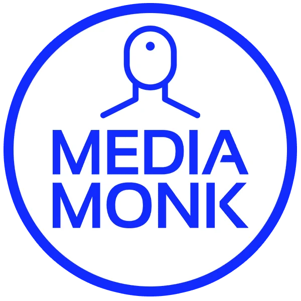
A circular shape is the most versatile in terms of its match with the various content types. However, it does not have to be a circle. It can be a square too. Here’s an example of a circular logo and a square logo.

The same Papa’s Pizza was further changed into a circular logo which is used in specific instances (e.g. videos) as a watermark. However, in another example, here’s a logo for another brand that was kept as a square.
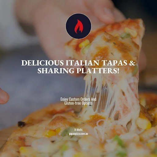
Now let’s consider how these two brands have used their logos to represent their brands across different content assets.
 |  |
 |  |
So as is evident from these examples, there’s a strong use case for uploading variations of the same logo to match the different content types you can produce inside Media Monk.
Producing Logos Online
There are a number of online tools that can be used to create a logo with variations to suit multiple use cases. One such tool that we found to be particularly helpful is Looka.com – it’s an AI-based logo generator that provides a very easy-to-use interface for producing logos without any design skills.
Canva.com is another popular tool that is used by a number of Media Monk customers for the purpose of getting the right set of logos.
Give either of these tools a go and let’s get cracking with content creation.


